Stretching apps exist in abundance, but they solve the wrong problem. Yoga apps assume you already know what you need. Physiotherapy tools are clinical and intimidating. Generic routines ignore the fact that someone's lower back pain on a Tuesday morning has nothing to do with their shoulder stiffness on a Friday night. The goal was to answer:
StretchWell
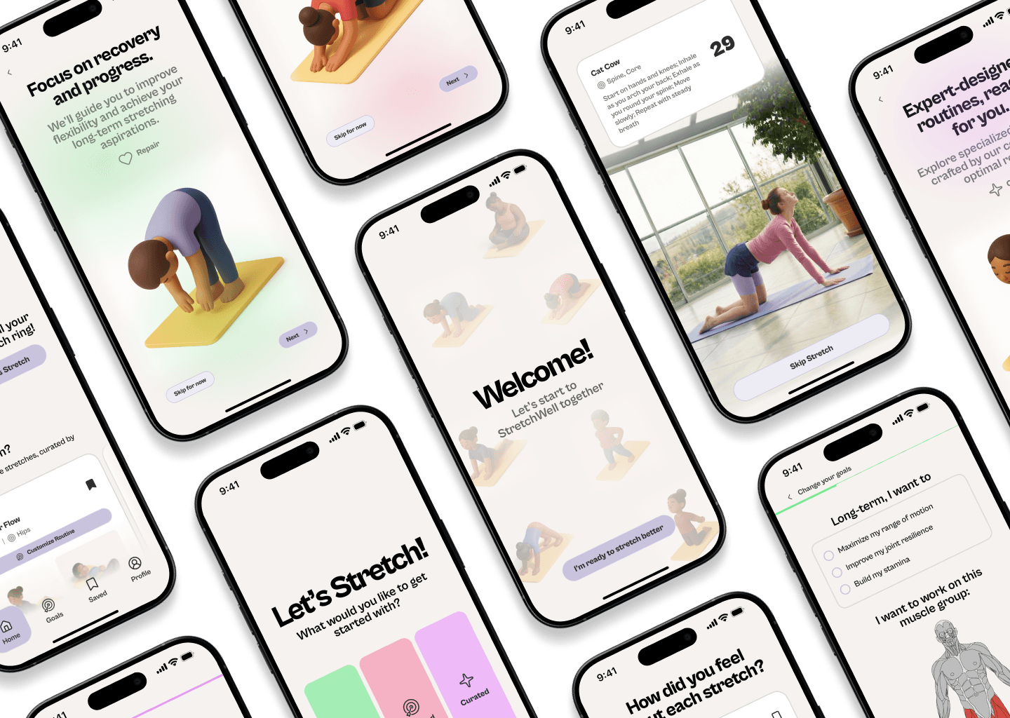
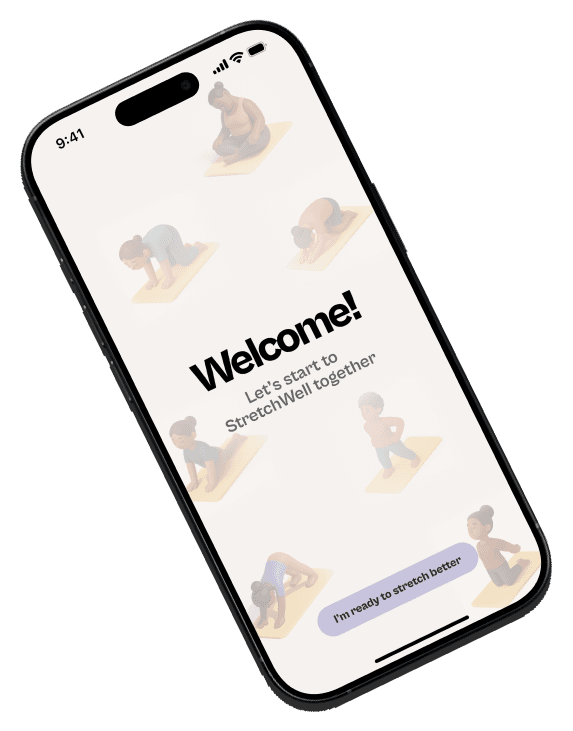
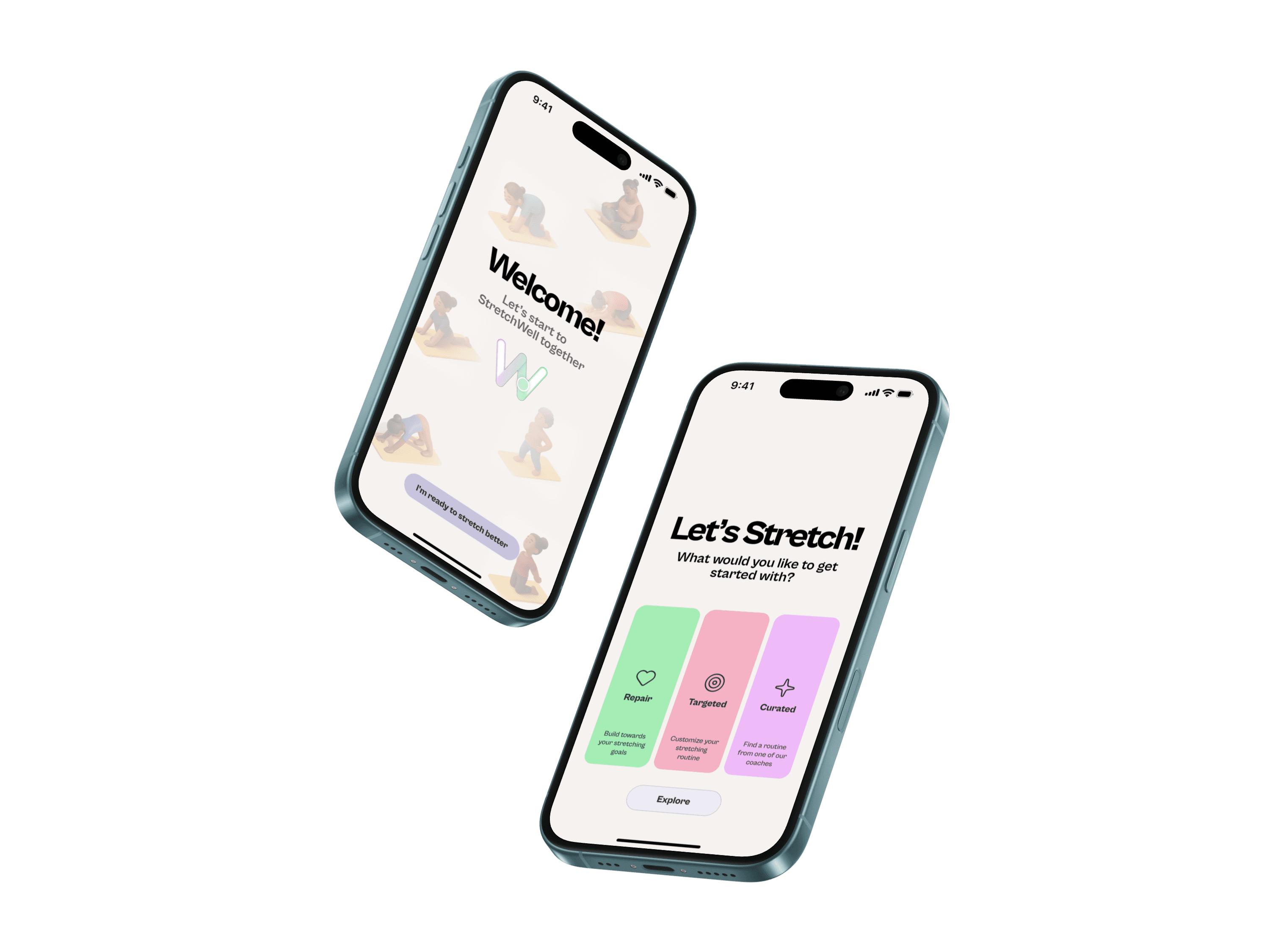
Most stretching apps tell you what to do. StretchWell starts by asking where it hurts. The app uses visual body-scanning and AI-generated routines to give people with chronic pain or physical tension a personalized path to relief — without requiring clinical knowledge, a gym membership, or an anatomy degree.
Work For
Digital Product Design Studio
Tools
Figma, Figma Make, Maze UX
Skills
Concept development, user journey mapping, information architecture, interaction design, prototyping
Year
2025
The Problem
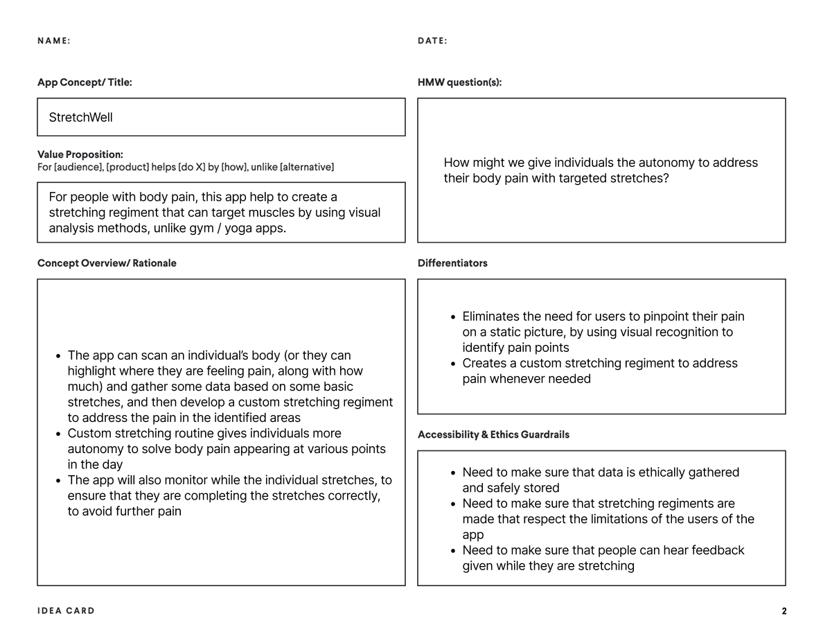
There was no tool that started with the individual's body, in real time, and built a routine around it. The value proposition was precise: for people with body pain, this app creates a stretching regiment using visual analysis methods — unlike gym or yoga apps that expect you to already know what you need.
Concept Development
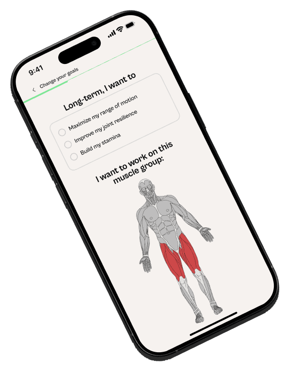
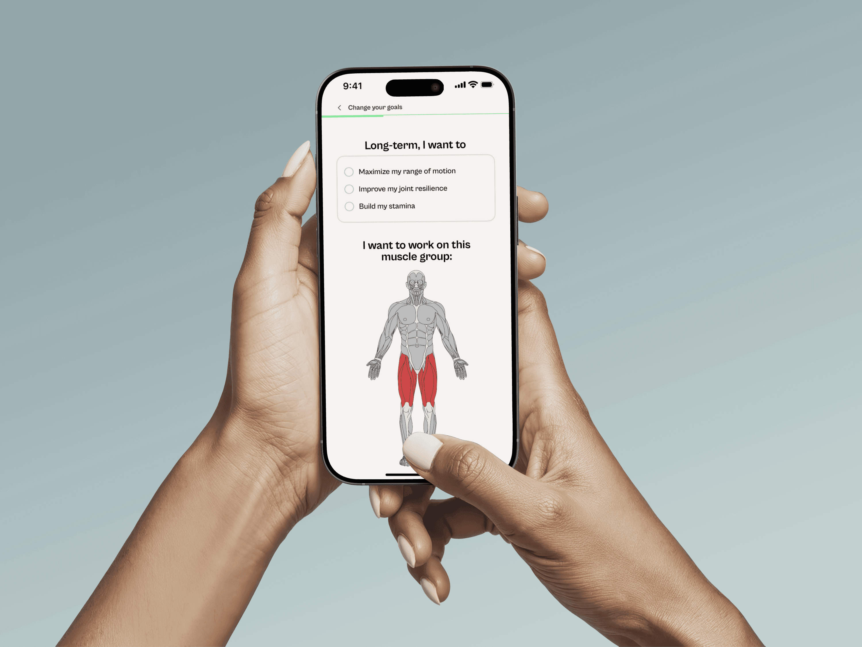
Two differentiators shaped every subsequent decision: eliminating the static pain diagram by replacing it with visual recognition, and generating fully custom routines rather than fixed programs. Ethics guardrails were identified in parallel — responsible data handling for body scans, respect for physical limitations, and clear audio feedback during stretching.
Mapping the Journey
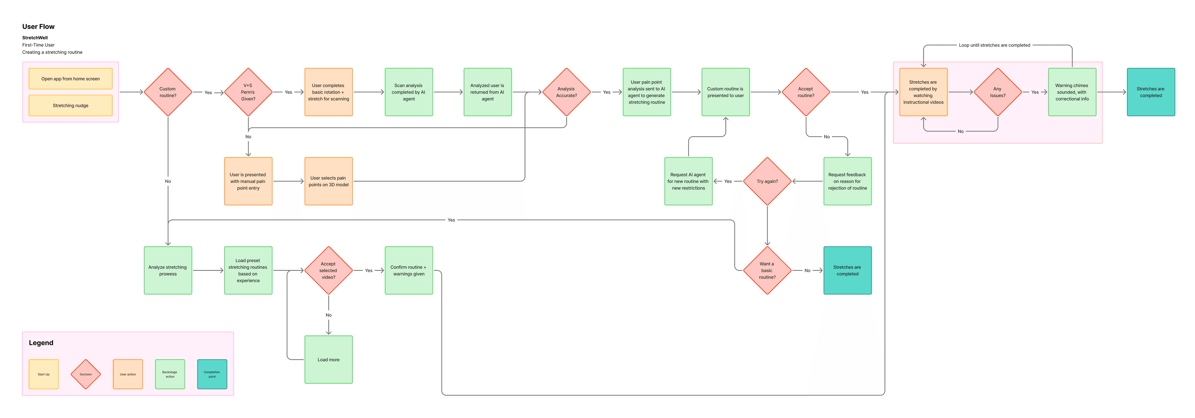
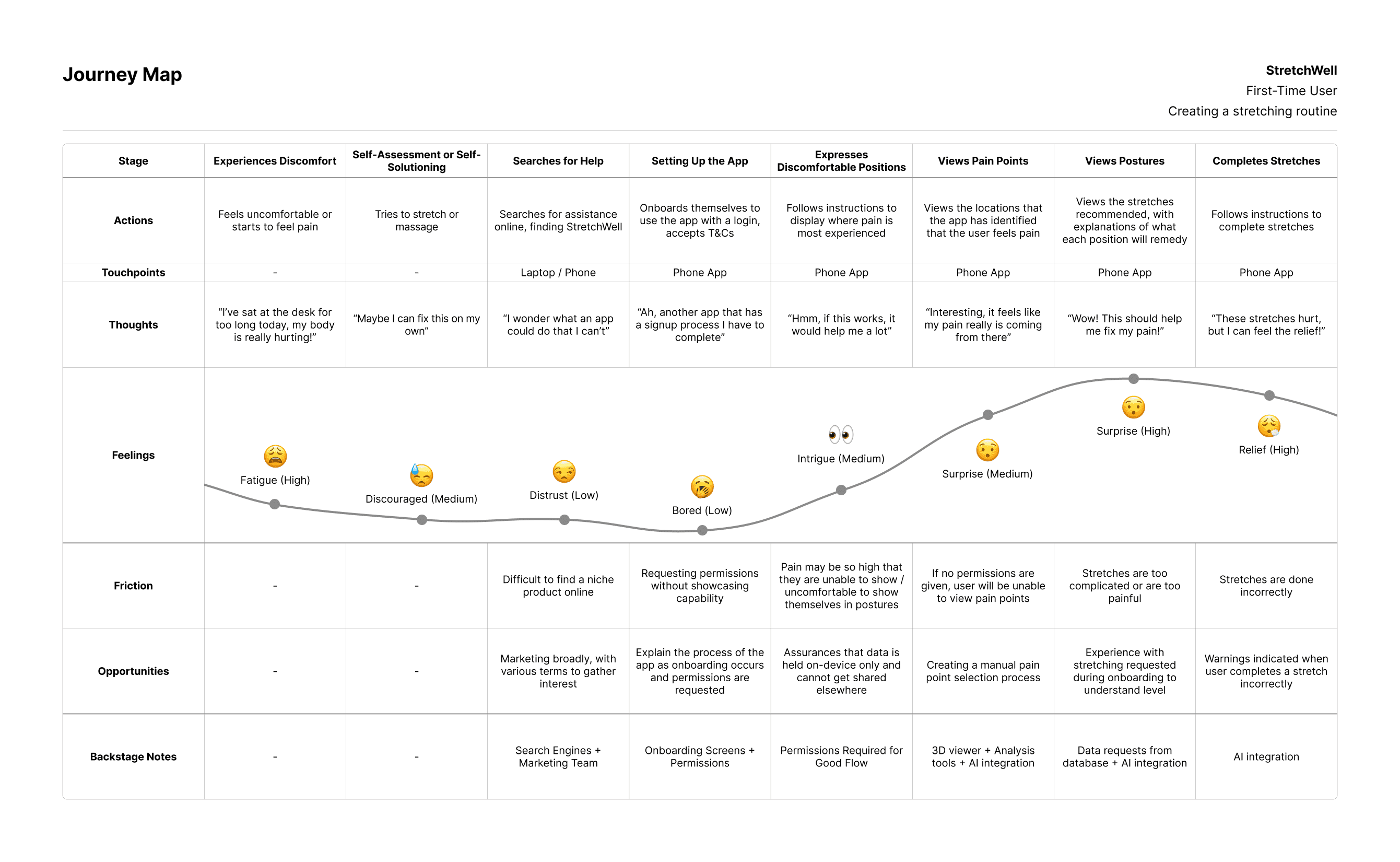
The journey map tracked actions, thoughts, and emotional state across seven stages — from opening the app to completing a custom routine. It revealed two critical branch points: a user declining camera permissions (requiring a manual fallback), and a user rejecting the AI-generated routine (requiring re-generation or a basic routine option).
Sketching the Structure
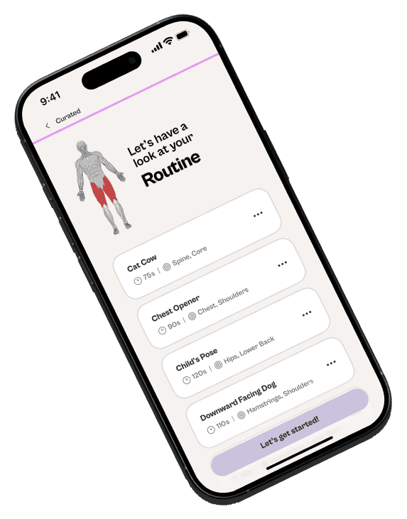
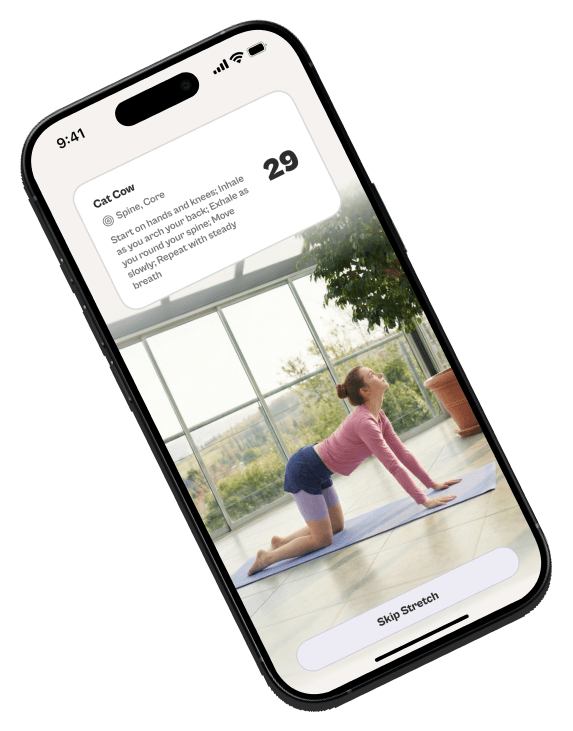
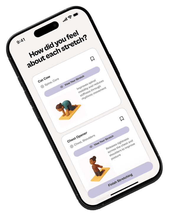
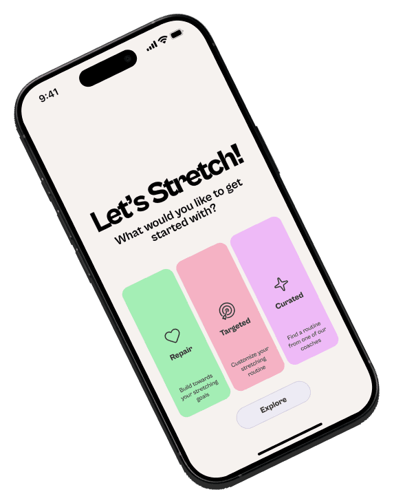
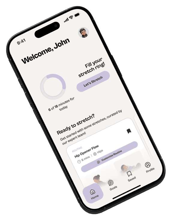
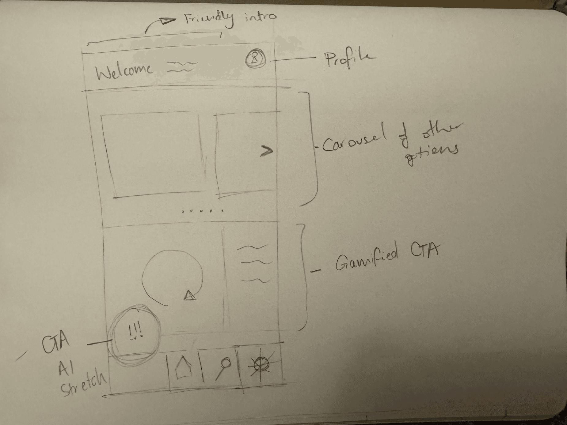
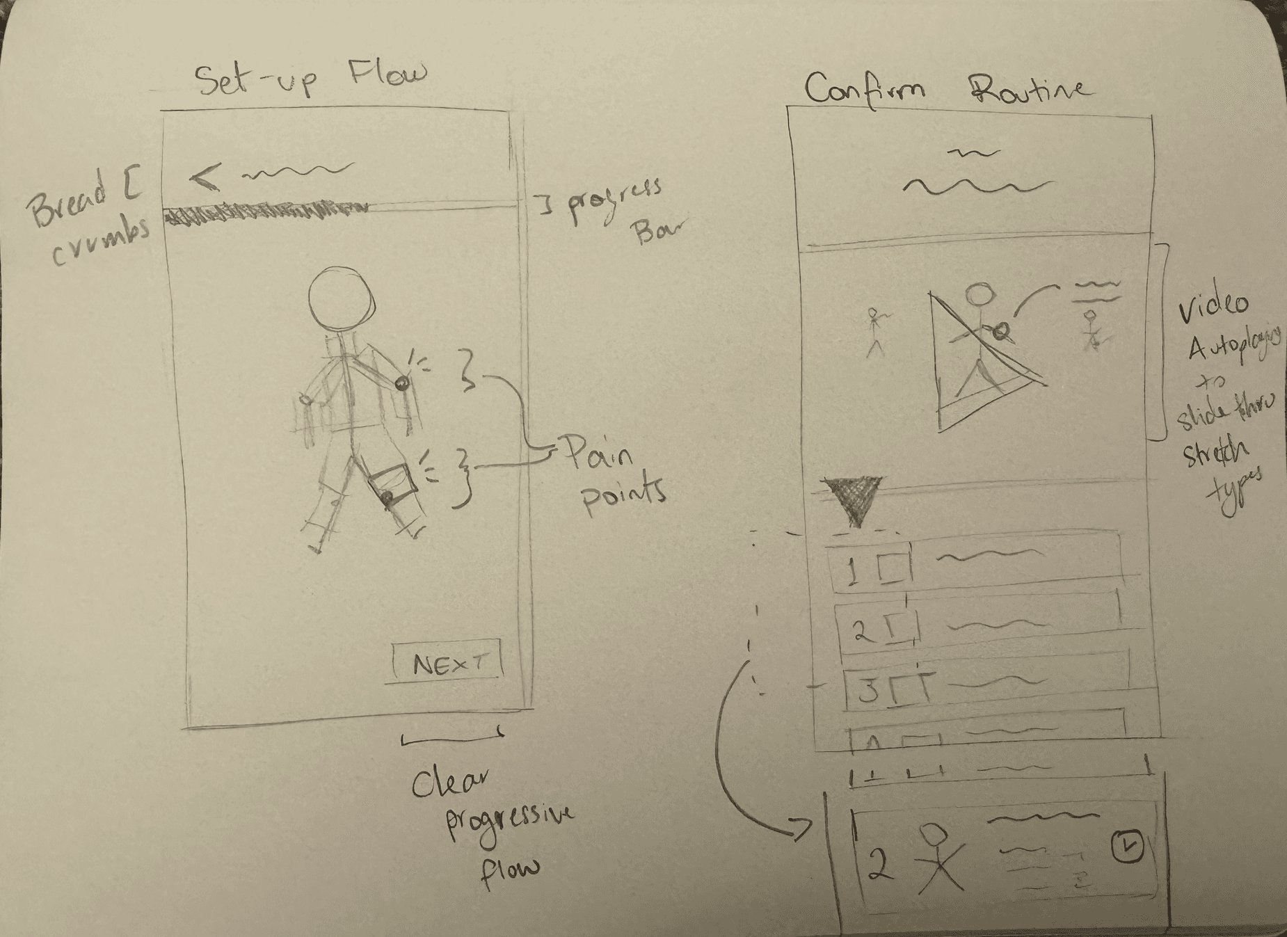
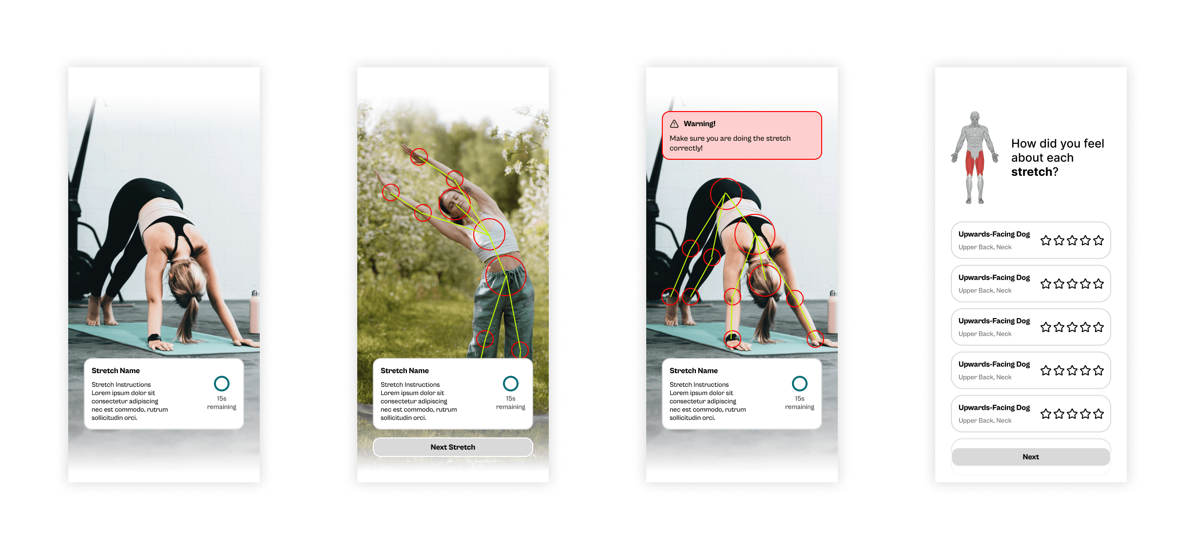
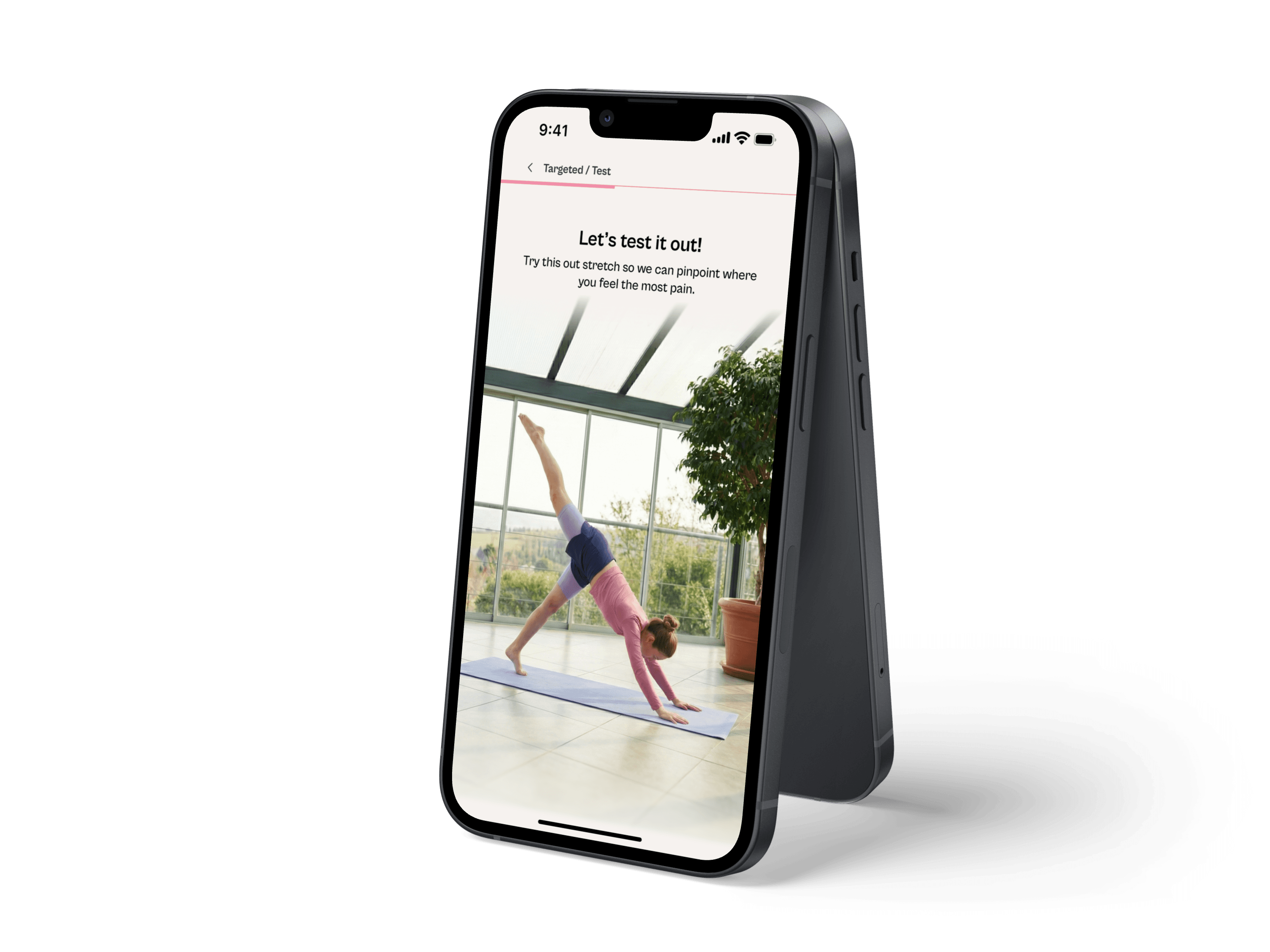
The home screen centred on a gamified call to action — a daily stretch ring alongside a carousel of options to reduce friction at the point of habit formation. The setup flow used breadcrumbs and a progress bar to make a multi-step process feel navigable. The confirm routine screen used autoplay video to preview each stretch before committing.
Lo-Fi Prototype
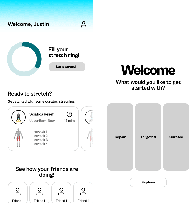
The lo-fi prototype validated the information architecture before any visual design investment — specifically the onboarding sequence, pain-point selection interaction, and routine confirmation layout. Realistic copy replaced placeholder text from the first wireframe onward, forcing real decisions about label hierarchy, button phrasing, and error states.
Design System
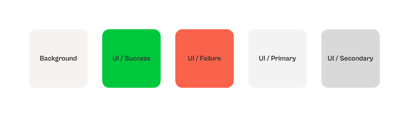
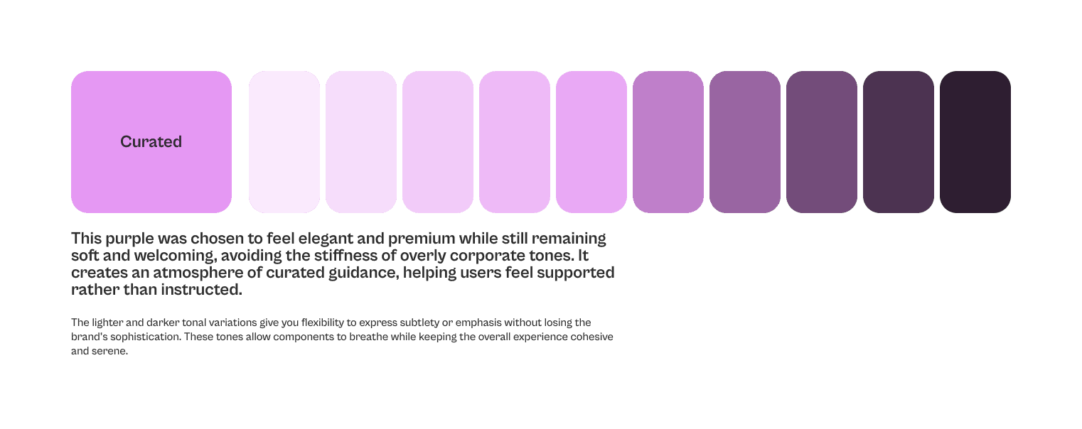
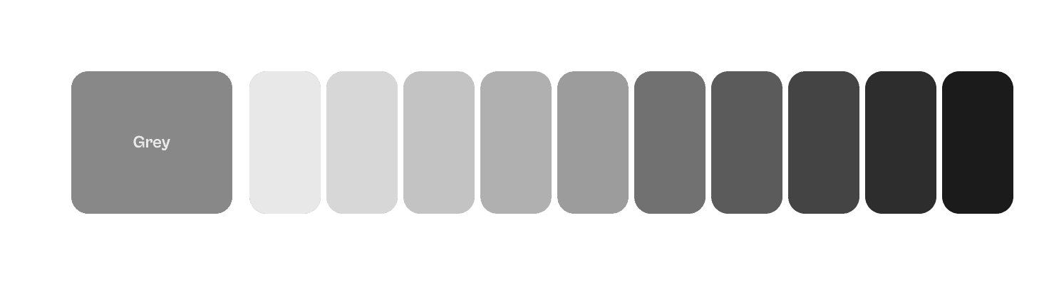
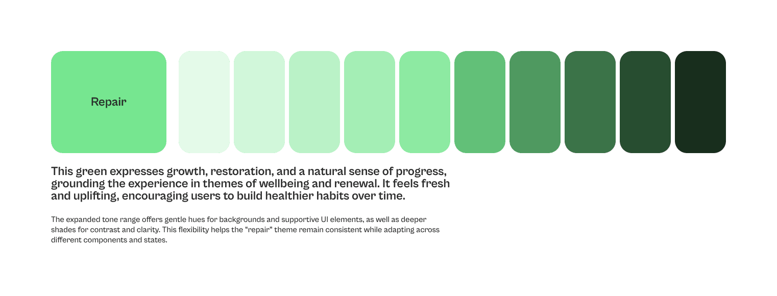
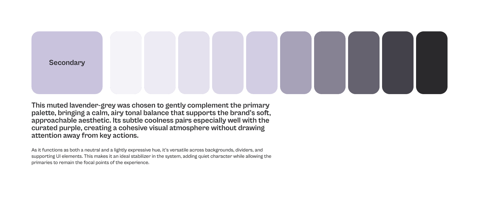
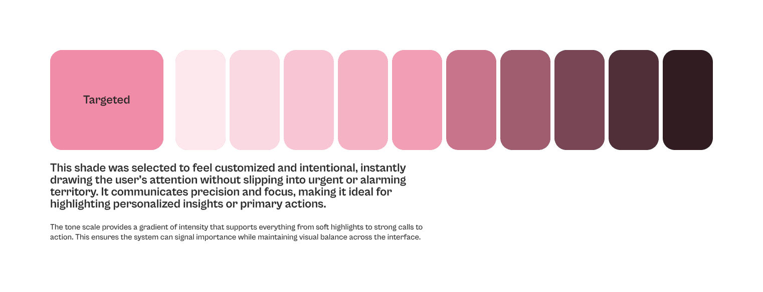
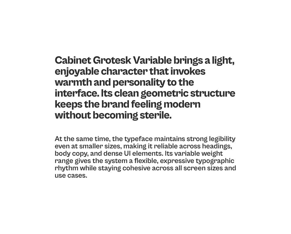
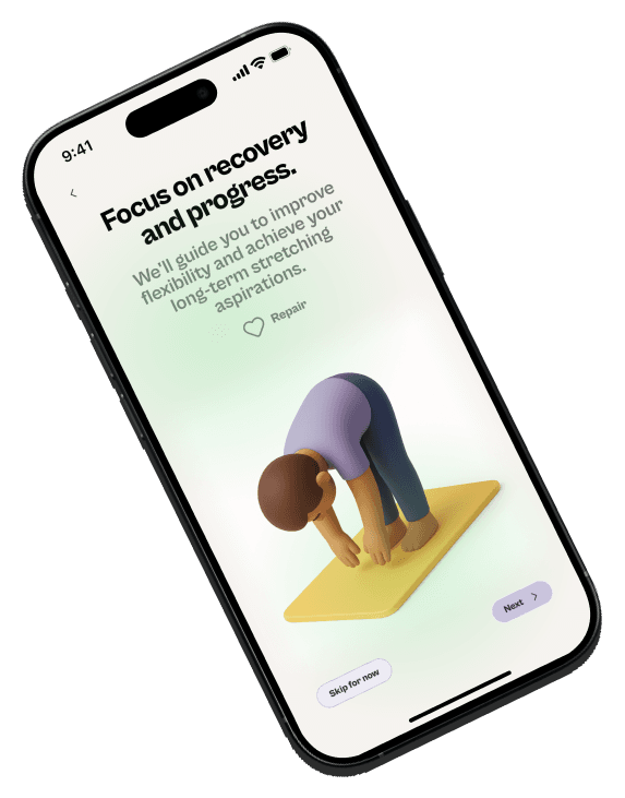
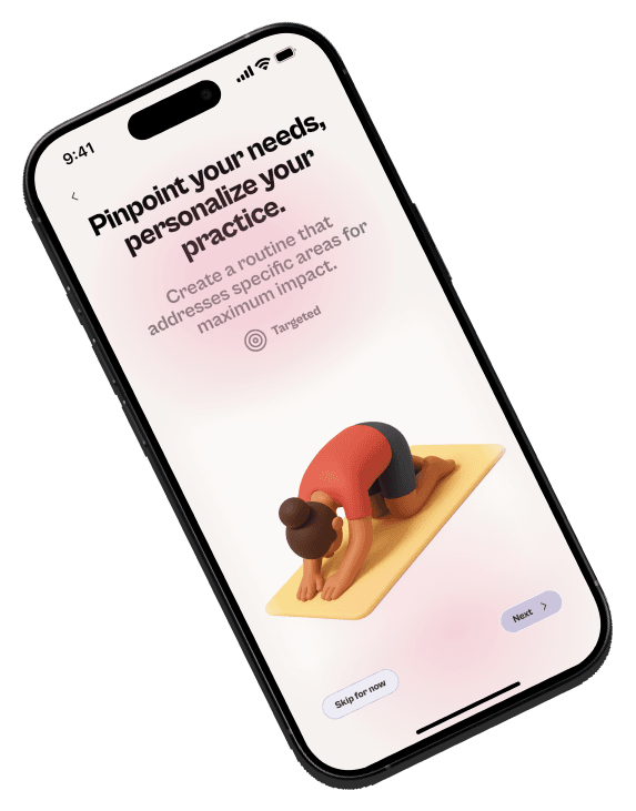
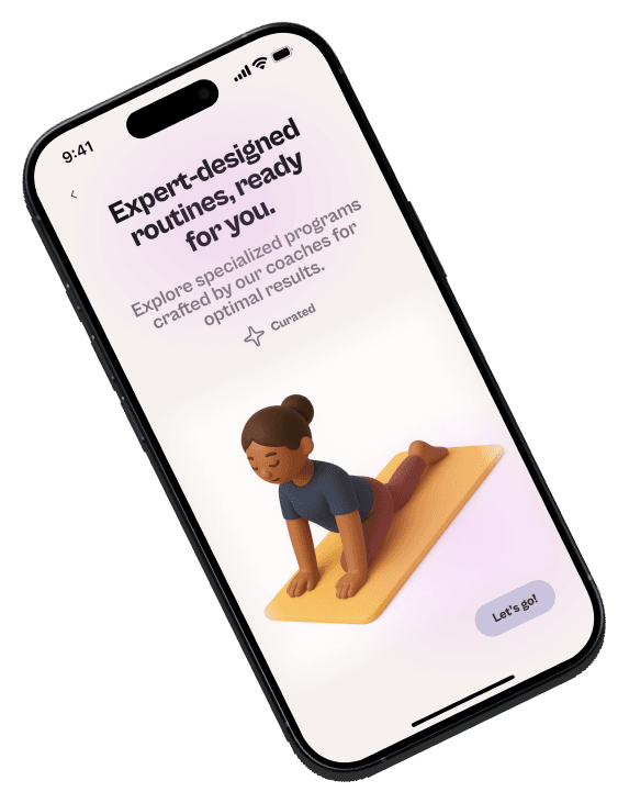
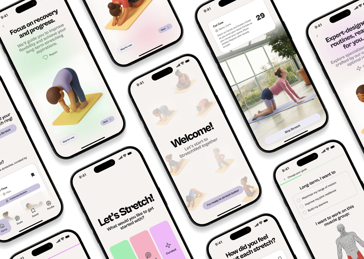
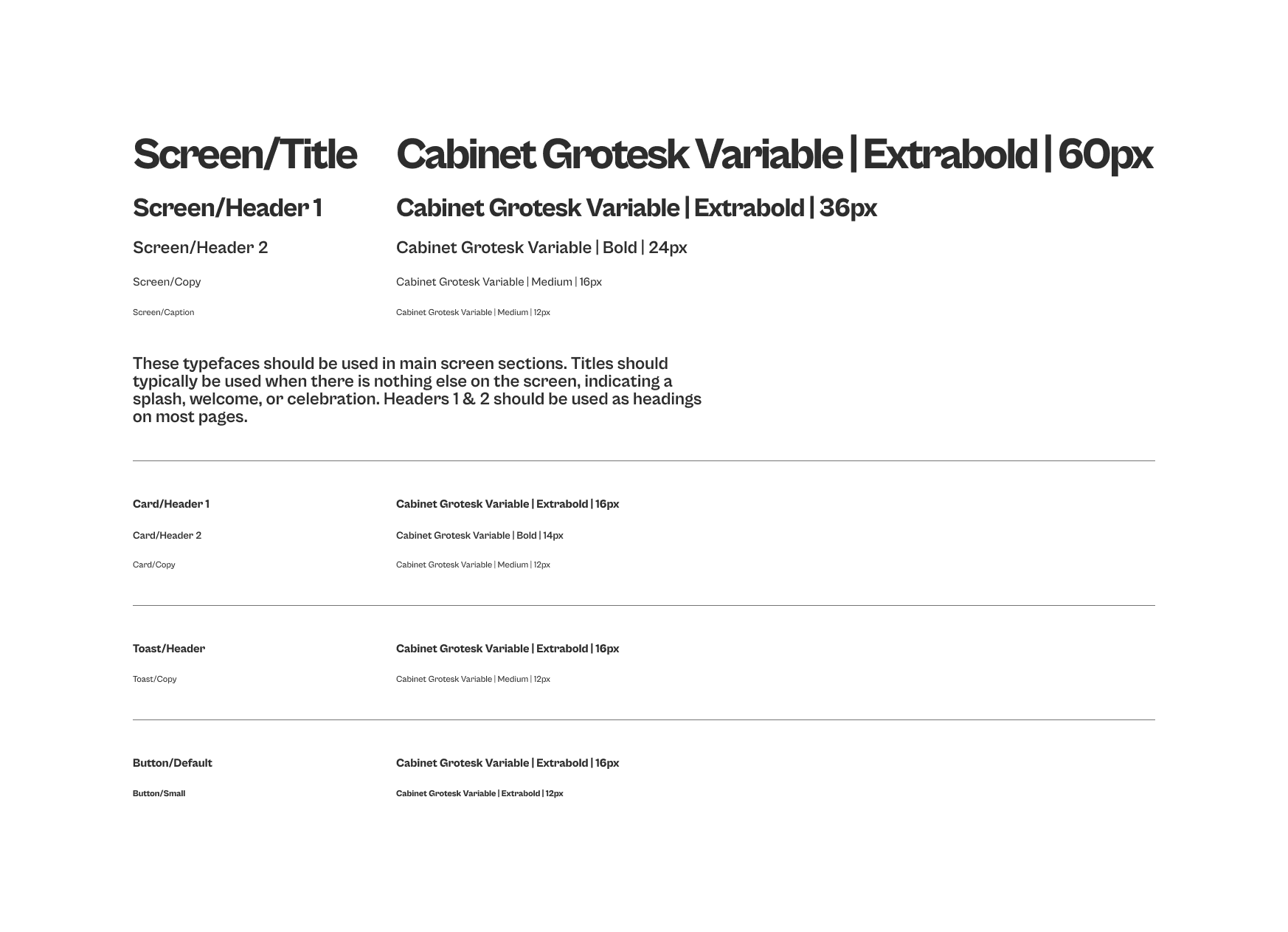
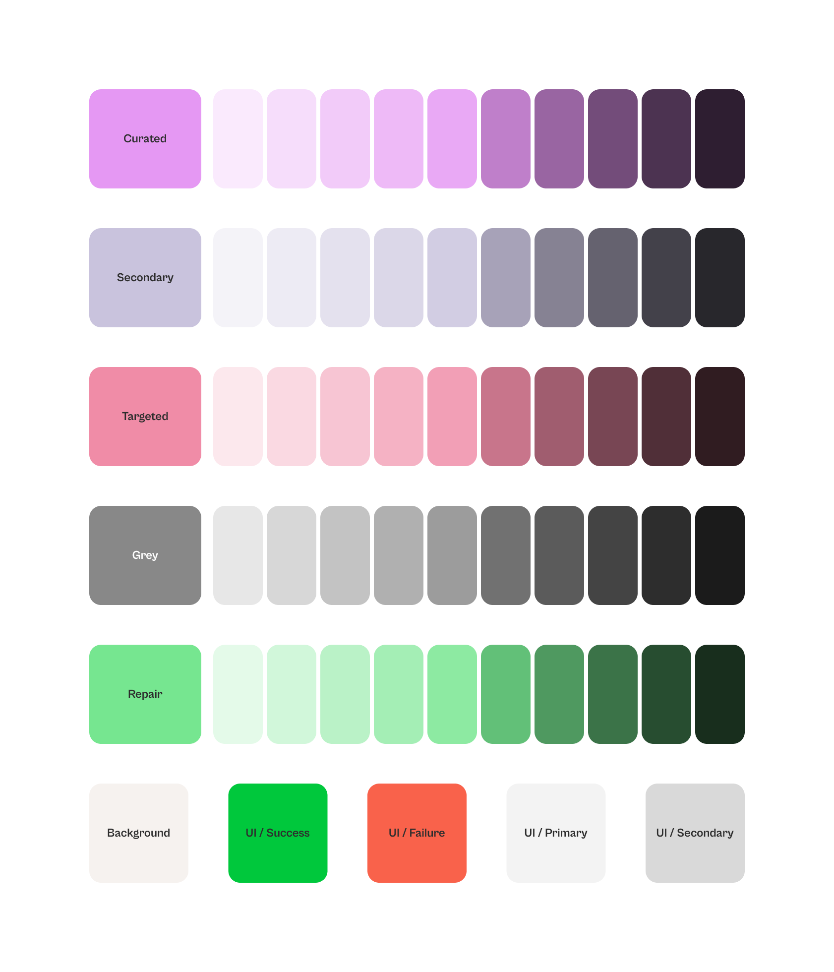
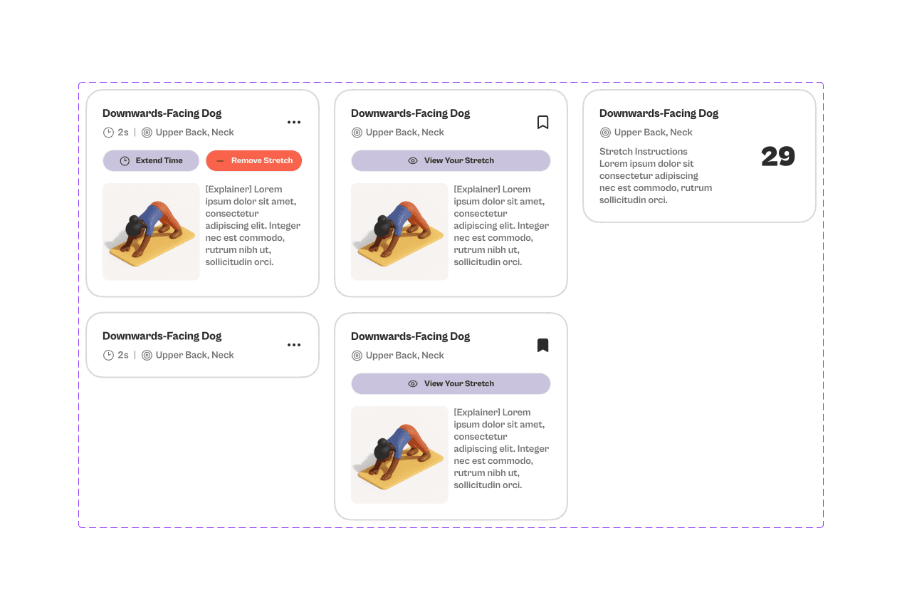
Four semantic palettes — Curated, Targeted, Repair, and Secondary — each with ten tonal steps, let the UI communicate intent through colour rather than text. Typography followed a strict two-level hierarchy: Screen styles for primary content and Card styles for compact components. Cabinet Grotesk was chosen for its rounded, approachable character.
What I Learned
The decision points that most shape the final product are made before any screen is drawn. The user flow work forced me to confront edge cases I would otherwise have discovered at prototype review — the rejected routine path, the permissions fallback, the loop logic for stretch monitoring. The design system investment paid back immediately once high-fidelity work began, allowing components to be assembled rather than rebuilt.
The next phase of this project would be usability testing with users who have chronic pain, specifically to validate whether the pain-point selection interaction and the AI routine output earn genuine trust.
Gallery